AnitaB.org Membership
UI/UX, BRANDING
Overview
AnitaB.org is a global non-profit organization that envisions a future where the people who imagine and build technology mirror the people and societies for whom they build it. Known for hosting Grace Hopper Celebration, the world’s largest gathering of women technologists, AnitaB.org connects, inspires, and guides women in computing, and organizations that view technology innovation as a strategic imperative. In 2020, the organization launched a robust membership program with a new visual identity and digital platform to support women technologists with community, opportunities, and professional resources 365 days of the year.
Problem
The former membership platform struggled with several usability issues, dated UI, and did not accommodate features included in the new membership program.
Goals
- Design a website with improved usability that drives users to premium features based on need.
- Create a visual identity and suite of marketing materials to promote launch and grow numbers of members.
- Create a visual identity and suite of marketing materials to promote launch and grow numbers of members.

Process
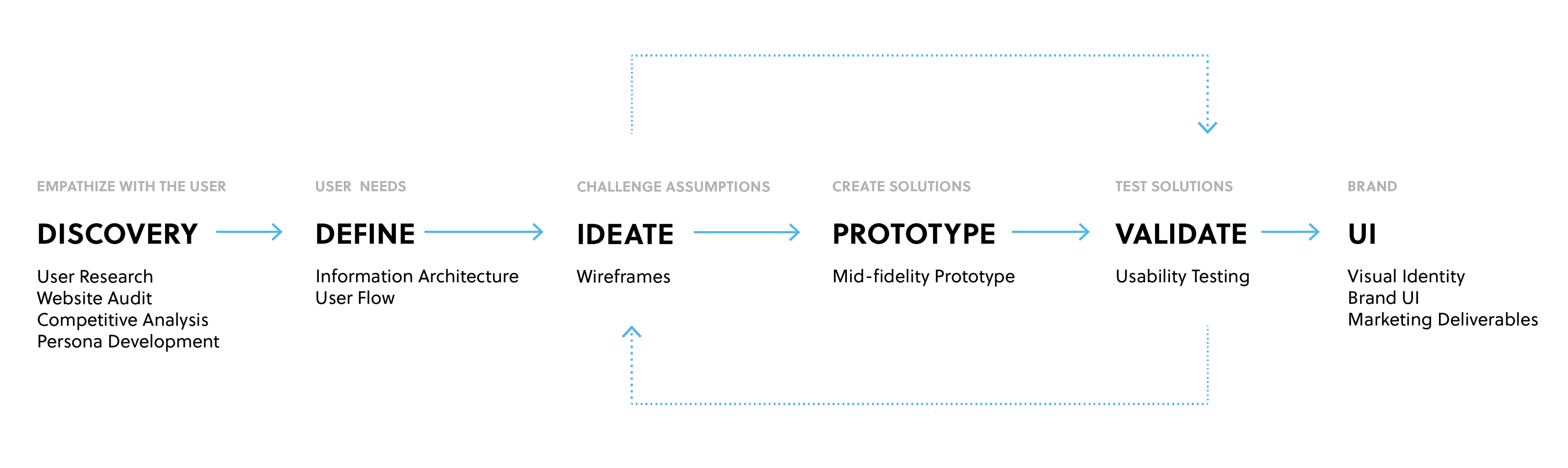

Discovery
USER RESEARCH
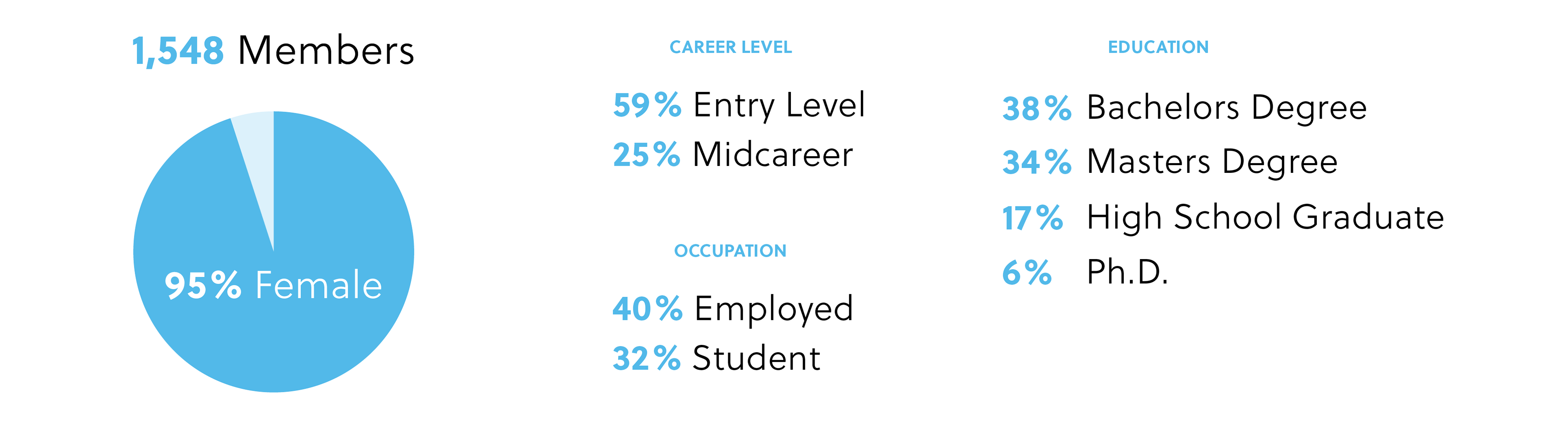
Member data was obtained from surveys, pop-up queries, enrollment questions and focus groups. AnitaB.org personas were analyzed to define user needs and identify pain points.
WEBSITE AUDIT
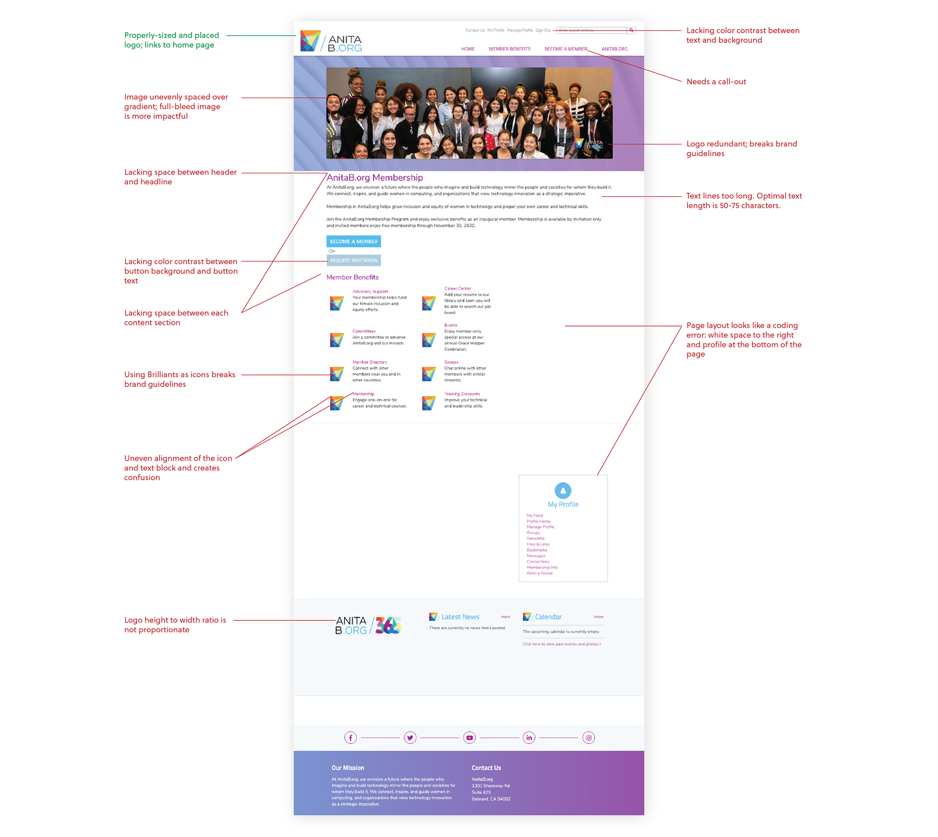
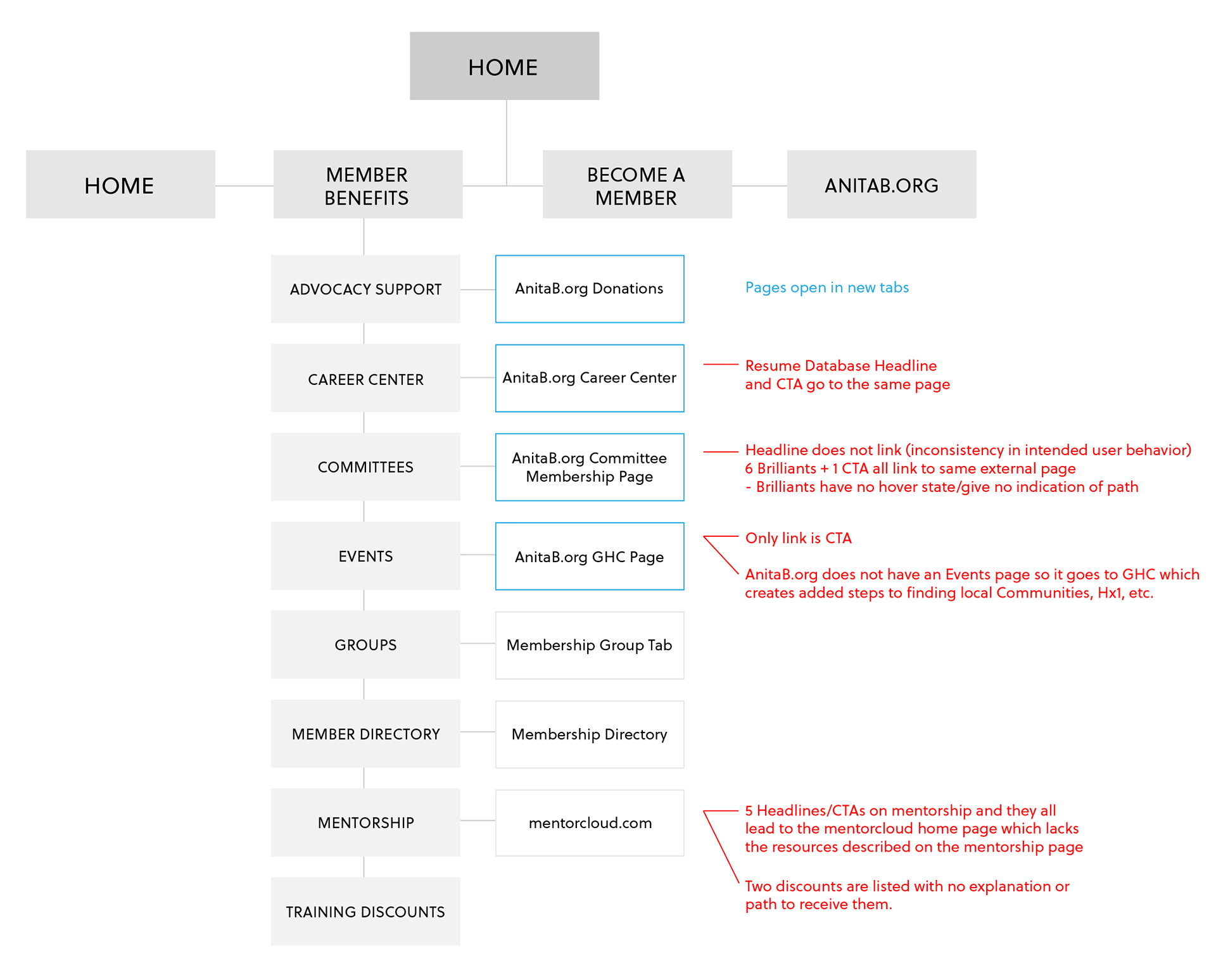
The former membership website struggled with usability issues. By conducting a website audit, user pain points and UI design flaws were identified. Member sign-in and new member enrollment user flows were hindered by uneven spacing in content blocks and a lack of hierarchy in type.
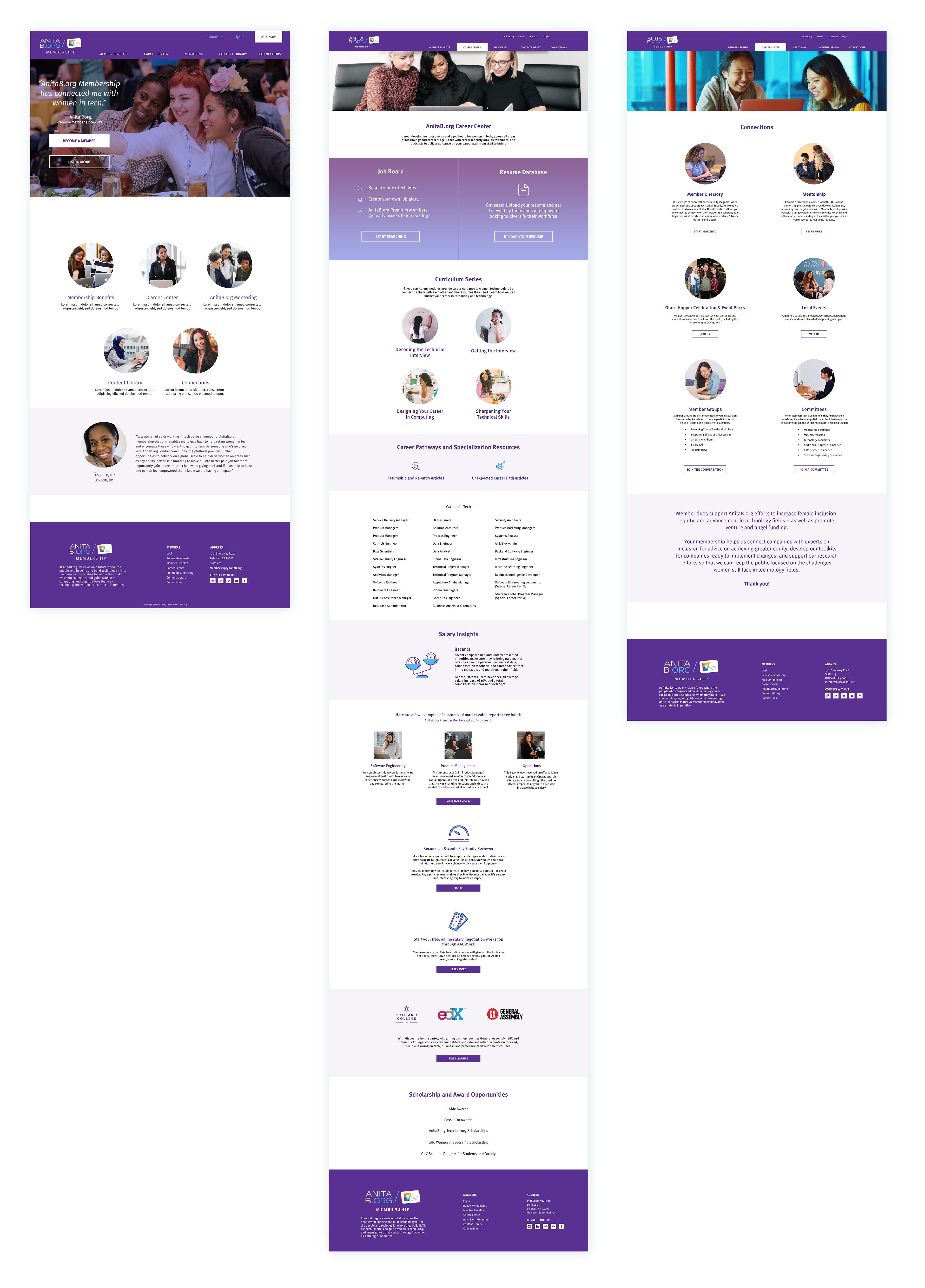
Home Page
Information Architecture
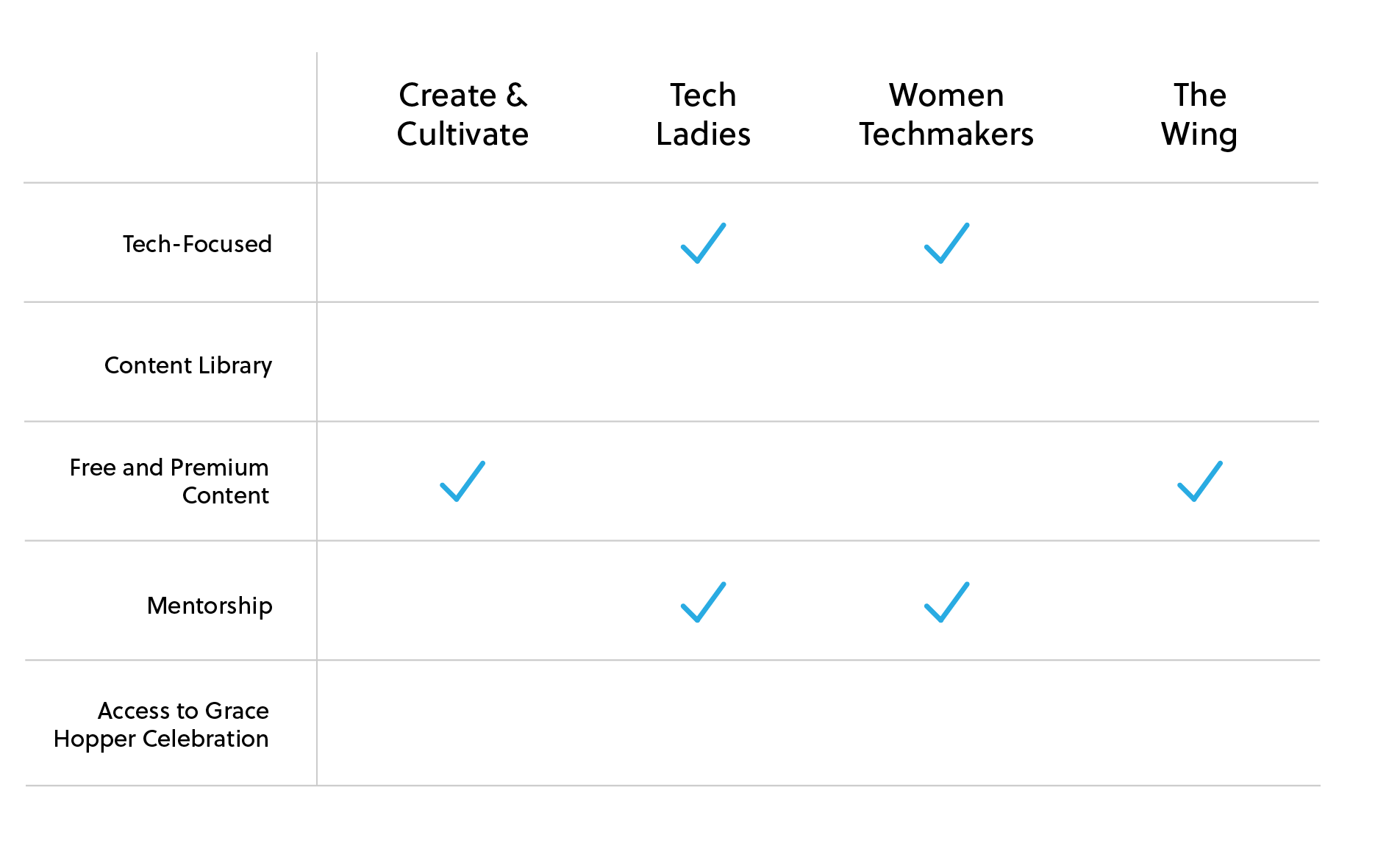
COMPETITIVE ANALYSIS
A review of the market's top performing women-focused membership programs led to a competitive analysis of Create & Cultivate, Tech Ladies, Google's Women Techmakers and the female-focused community The Wing. The results showed there is an opportunity for a program to help women technologists grow their careers and connect through tech-based events like Grace Hopper Celebration.
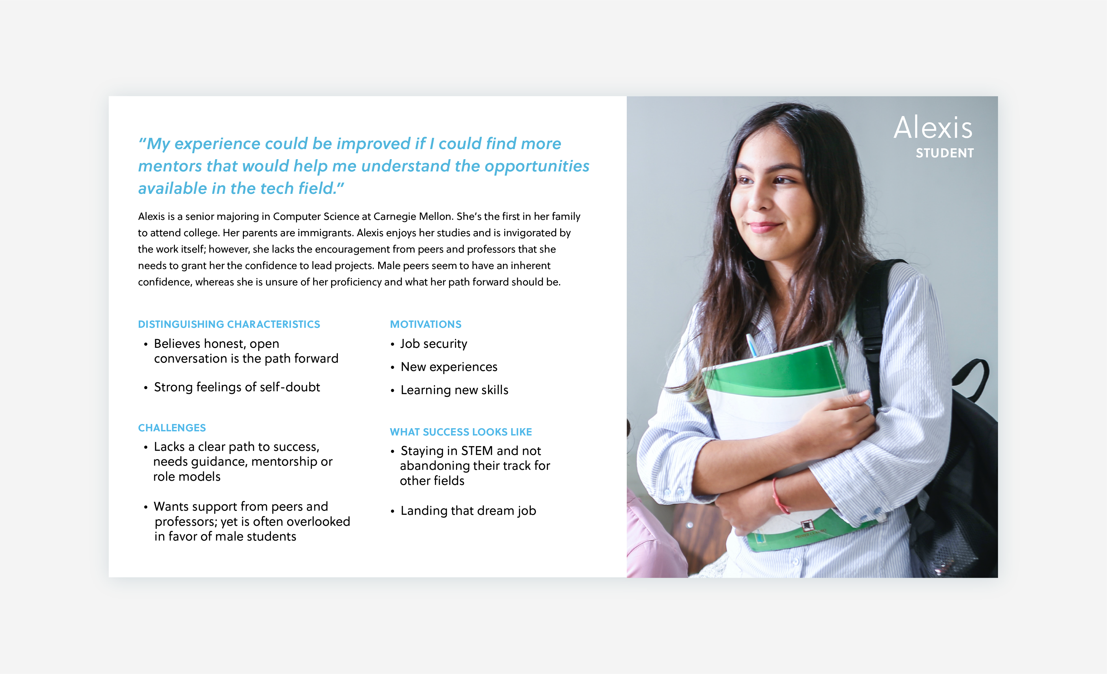
PERSONA
Meet Alexis, a Computer Science undergrad looking for mentorship.
Define
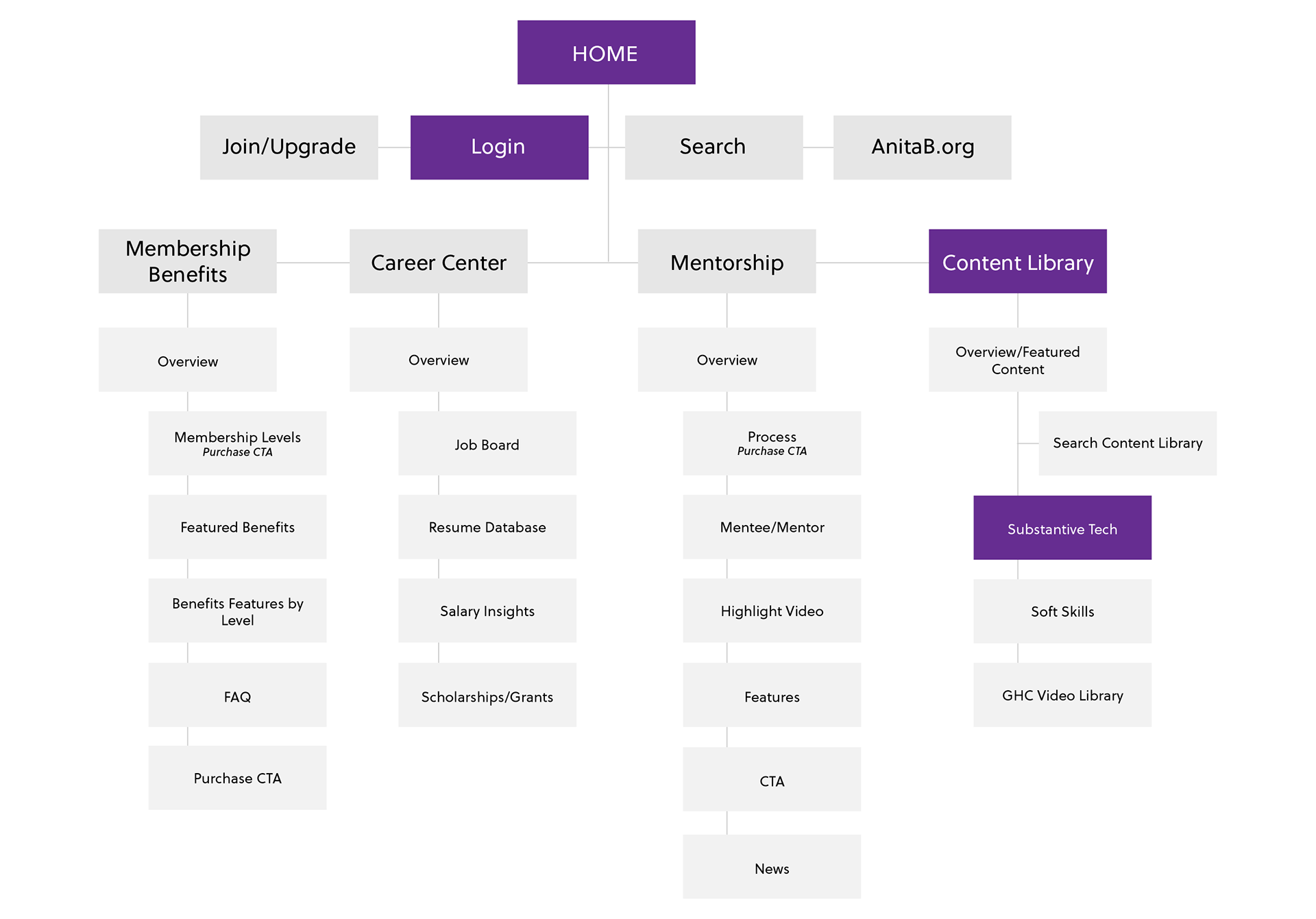
INFORMATION ARCHITECTURE & USER FLOW
With the features of the new membership program determined based on user needs, the new information architecture would relieve usability issues, including navigation to new member enrollment and member resources. Accessing the content library take three steps from the home page.
Ideate
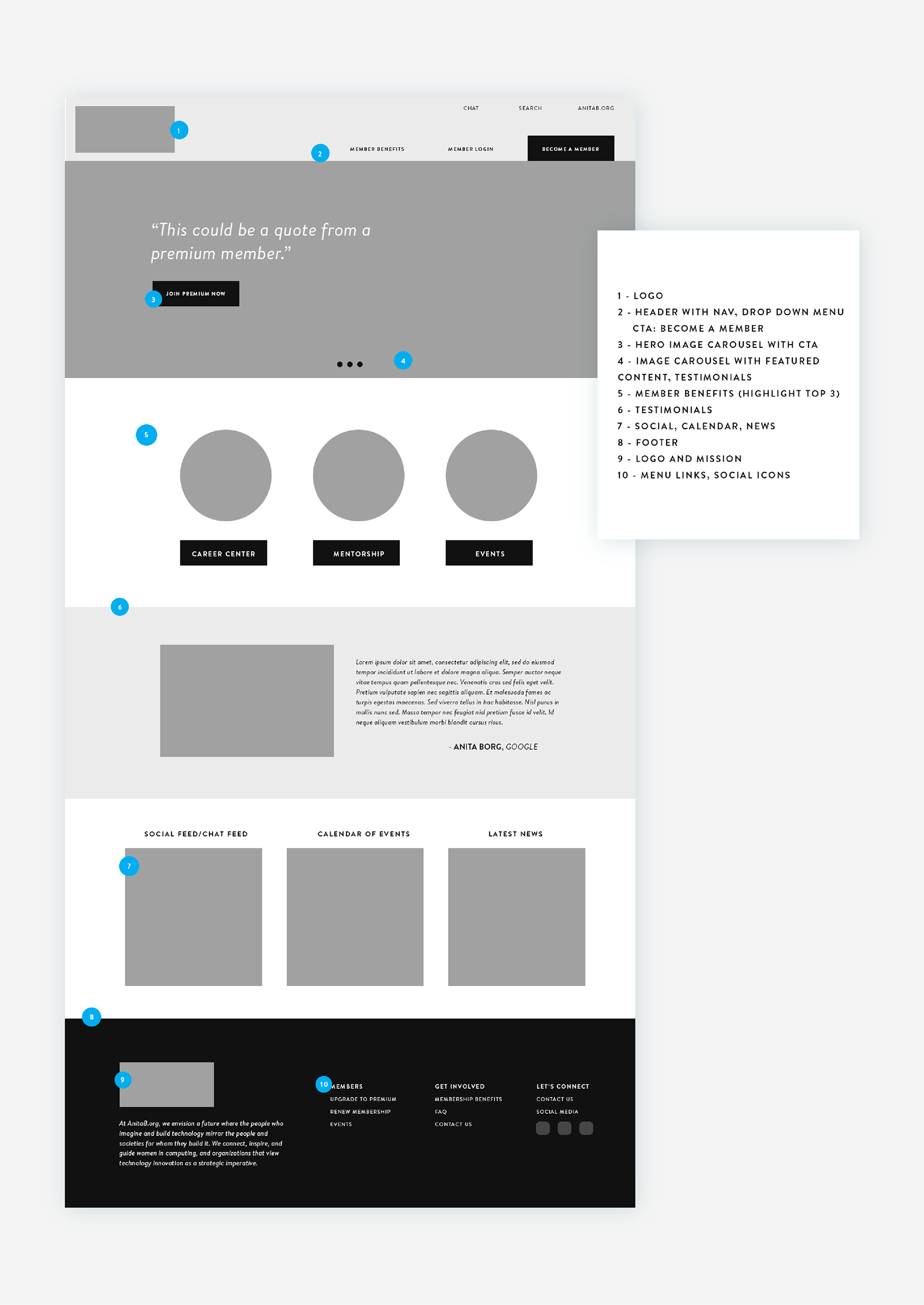
WIREFRAMES
I presented the landing page wireframe to internal stakeholders and reviewed with our third-party vendor to explore development timelines and design constraints. One design challenge we faced was the redesign of the AnitaB.org website by a different vendor at the same time. Stakeholders expressed the need for a visually seamless transition from the AnitaB.org website to the membership website.
Prototype
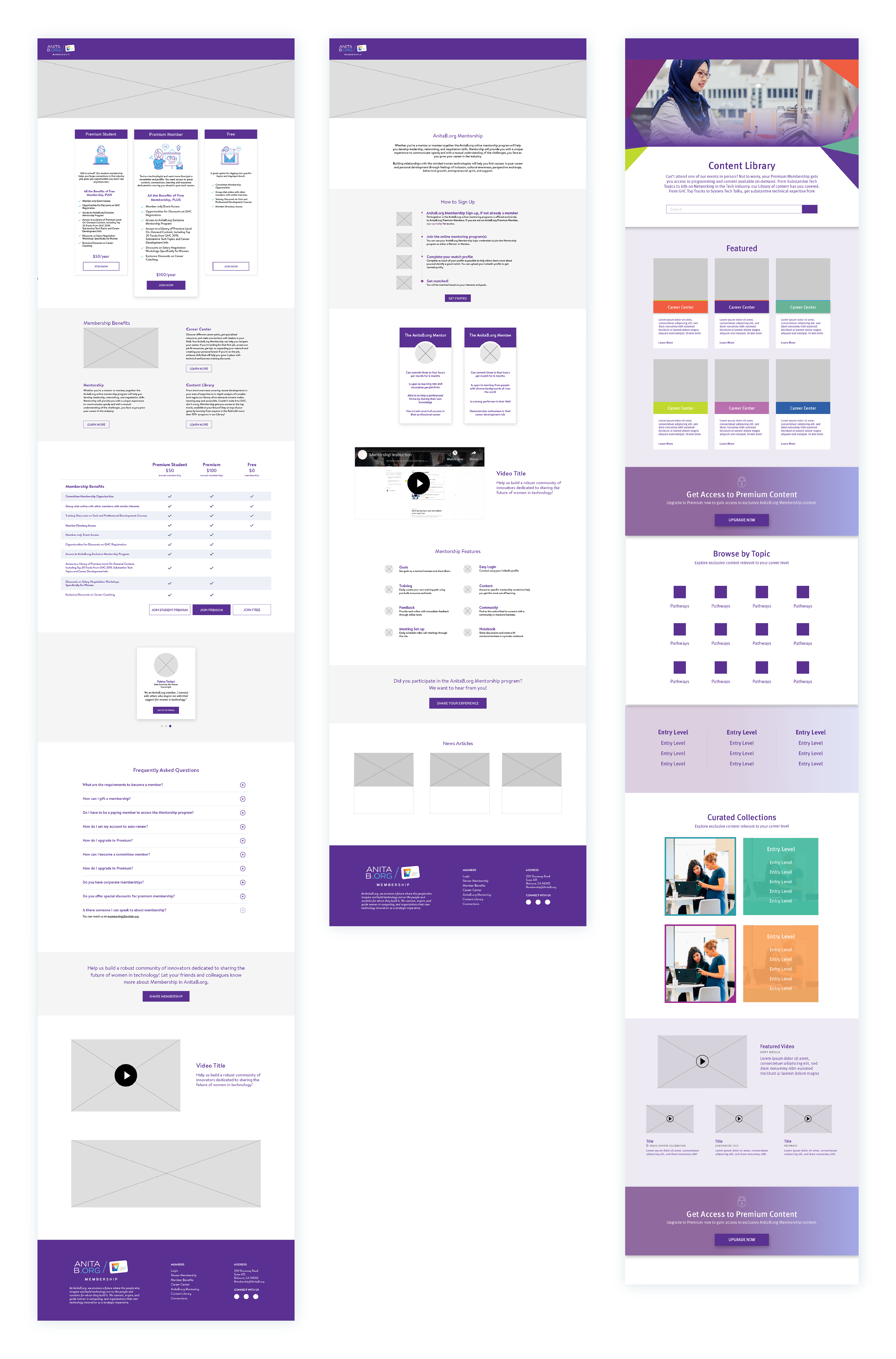
PROTOTYPES
Prototypes were returned from developers and reviewed with stakeholders. I oversaw design execution and addressed issues with site responsiveness and accessibility concerns like text over images and color contrast in text.
Validate
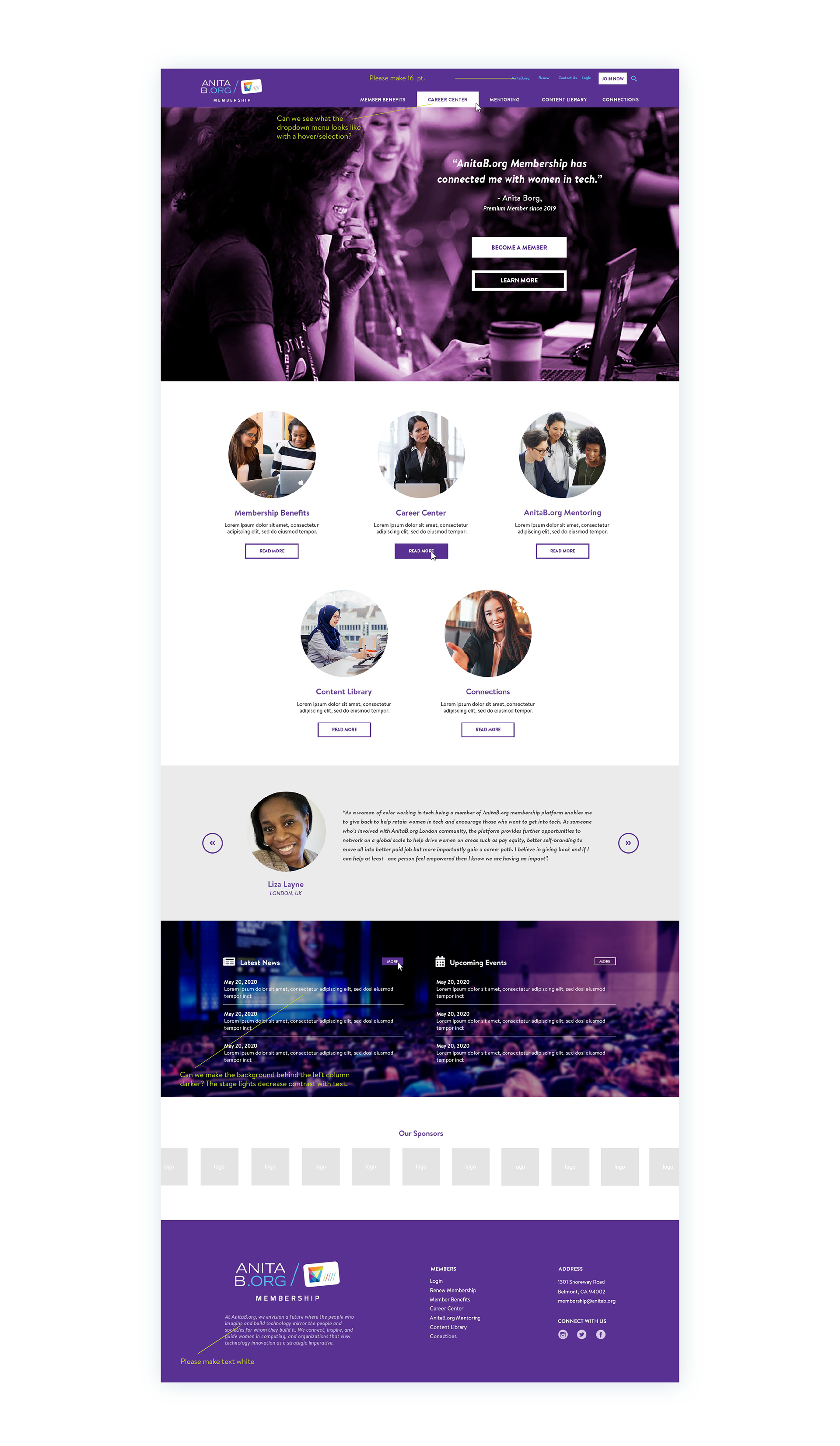
USABILITY TESTING
Multiple usability tests were performed by internal staff. Each tester followed specific instructions to navigate various user journeys such as new member enrollment, member payment, and accessing the content library. Testing is ongoing through the website soft launch and a full launch is expected in July.
Branding
USER INTERFACE
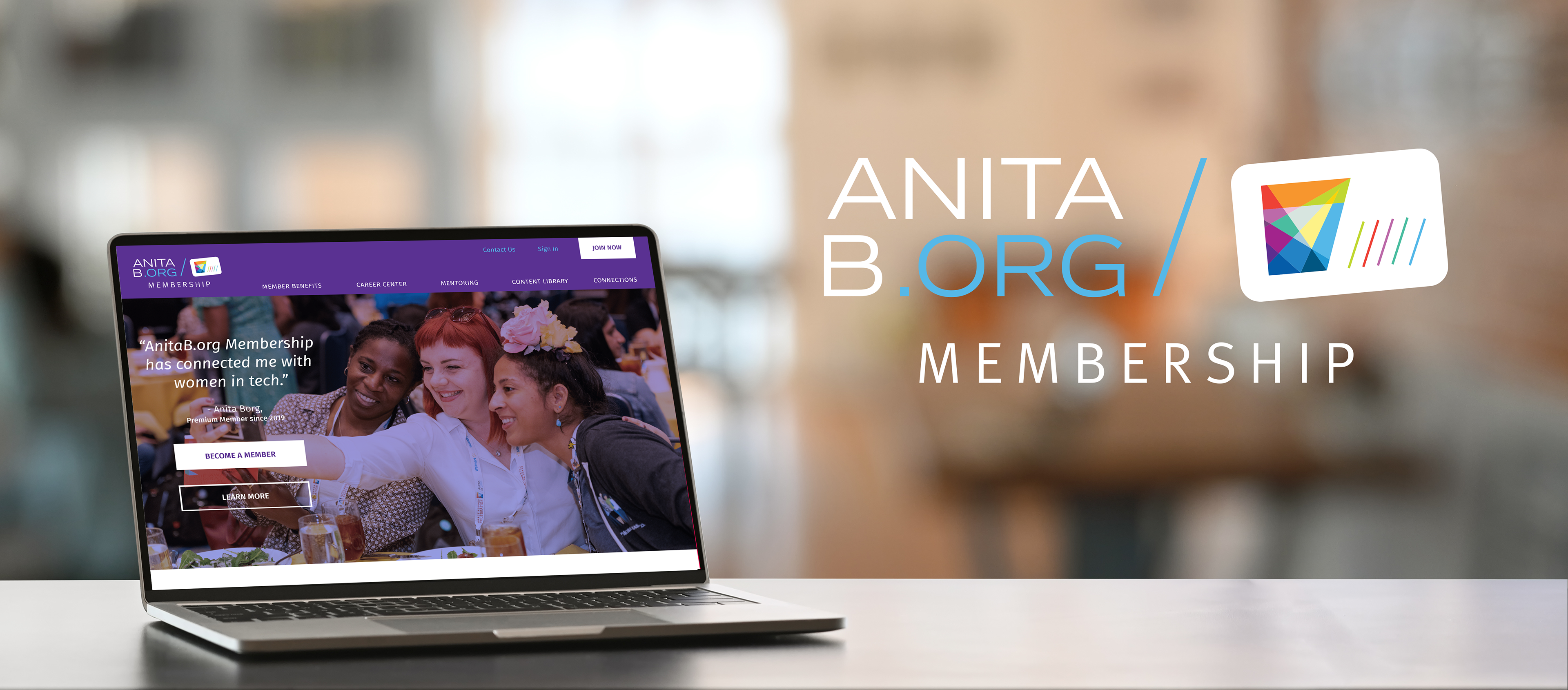
With a full suite of premium membership offerings, AnitaB.org wanted to refresh the look and feel of the program with a distinct visual identity. To do this, I designed a logo exclusive to AnitaB.org Membership and minimized the extensive color palette of the brand focusing on a dark purple and Caribbean blue.
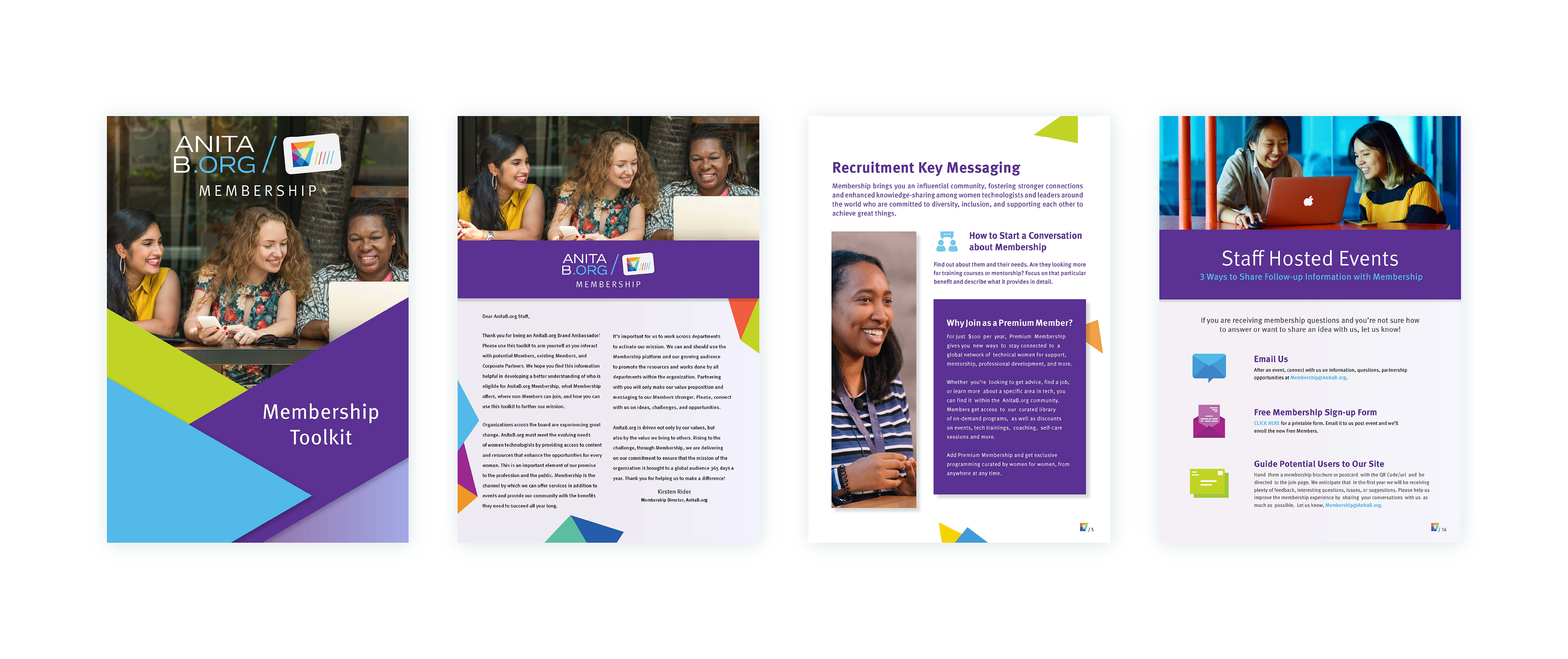
MARKETING MATERIALS
To support the launch of the program, the new identity was applied to community emails and a toolkit was created for internal staff to help recruit new members.